Tips For Keeping Design Systems Under Control
Tips For Keeping Design Systems Under Control
Back to the roots, let’s recap why design systems exist in the first place
The concept of design system has been around for more than 50 years now and certainly, there are reasons why it has become a key part of the product development process.
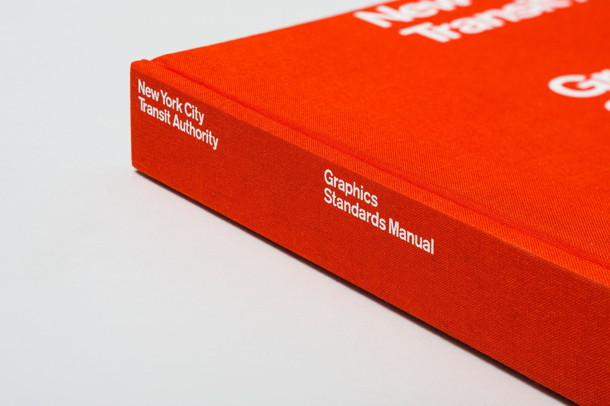
In retrospect, ever since Douglas McIlroy presented component-based development as a solution for the Software crisis at the NATO conference in 1968 and two years later that the New York City Transit Authority Graphics Standards is published, the design systems had and still has the same fundamental values at its core. By making design reusable, these fundamental values enable designers to create products not only faster but also better, and as a result of this, reusability makes scalable solutions for different problems.
Today, the concept of the design system is maturing, and maturity comes with more things to contain and more efforts to maintain a meaningful system. It goes without saying that, and yes contrary to popular myth, a design system consists of more than just a UI kit and a pattern library or a code library.
More than ever we are aware that design systems are crucial
Particularly after Atomic Design entered the design scene and equipped designers with a more comprehensive and diverse semantic for the design systems, along with the introduction of Material Design as well as Human Interface Guidelines, the design systems have turned into a file that is expected to contain things like framework-specific components such as react or angular, platform-specific usage guidelines, versioning, documentation and most crucially accessibility guidelines.
That being said, it is also important to take into account that where the design systems are going and how it’s evolving. There are exciting emerging technologies for speech and augmented reality where we still need to create consistent, scalable products. For example, speech assistance and bots need a tone of voice, branding elements, usability details and rules, dependencies, etc. depending on the brand’s need. In the same way, we have icons that we have in a system, we can have common phrases as a group with different states for confirmations, alerts, or errors. Another brilliant example of a possible future use case for the design systems comes from Airbnb. The company already did an amazing job by standardizing the components in its design system for its entire ecosystem. Afterward, they take it to the next level by creating automation technology that converts sketches from a whiteboard or wireframes to a visual design that consists of standard UI components of Airbnb.
As the impact of the design system grows and spreads, so does the responsibility and its overhead. Significantly increased visibility of the design system and involvement of different disciplines are leading to remarkably more emails and meetings. At the same time, the design systems demand more and more effort, such as documentation, versioning, platform specifications, or support multiple frameworks. At this point, I’ll let RuPaul express my feelings, just like she says before her famous chop-off;
“With great power, comes great responsibility.”
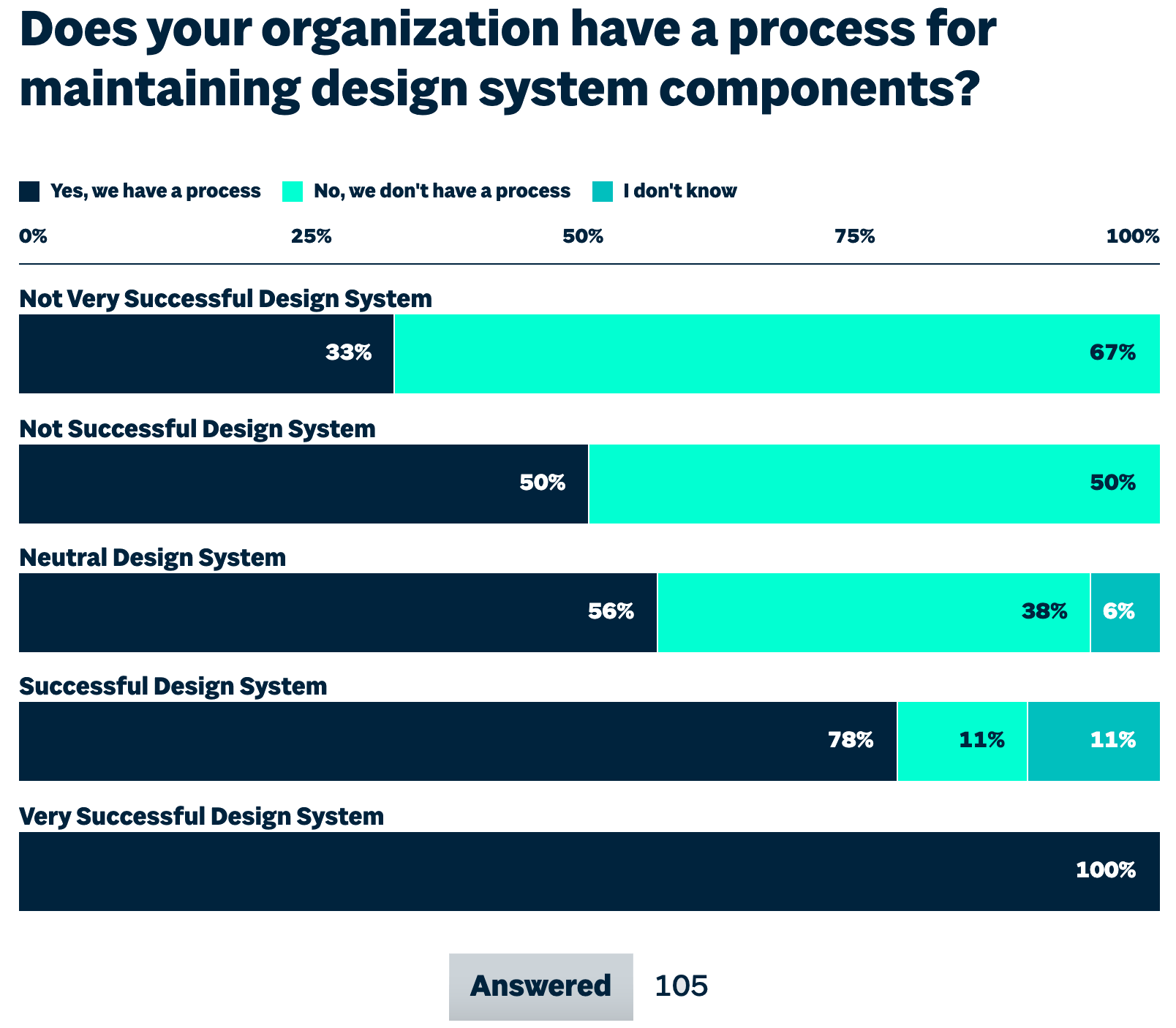
According to Sparkbox’s 2020 Design Systems Survey, when they ask how building the design system created a technical debt, the two top responses were both related to a planning failure: lack of planning and failure to understand the magnitude of a design system.
Having control over the system enables us to keep components and styles reusable while keeping a focus on efficiency through consistency. Let’s address some of the tactics to overcome obstacles related to the planning and magnitude of a design system.
Before you start: A checklist
There are so many moving parts as well as so many things to define before you start composing a design system. You have to make sure that you clarify code conventions, components, tools, but most importantly, design principles that you have and their prioritization between each other.
At this point, it is really helpful and important to have a bird-eye view. Checklists are a great way to provide a bird-eye view to ensure consistency and completeness. Nevertheless, this checklist doesn’t present a conclusive list of items for every design system. It is only a very beneficial set of guidelines for you to keep up with everything you’ll want to check off and allow you to plan, build and grow your design system. When the first time you go over the design system, it doesn’t have to be 100% finished. That’s why having a checklist will also help to provide a small-scale roadmap for the design team.
To keep it simple and reachable, have this checklist on your Figma file. In this way, other team members contribute and review the design system at the early stage of the project. Also, in order to eliminate any potential bias, we value diversity in our review team. Having a checklist in your Figma file paves the way for collaboration with different backgrounds across design and engineering roles.
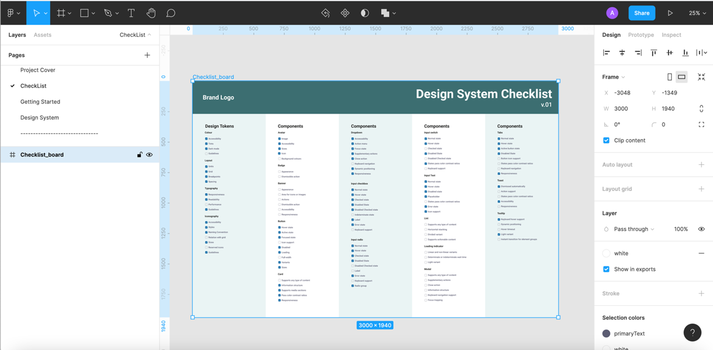
If you need a more comprehensive and ready-to-use checklist, I highly recommend that making use of the Design System Checklist. It’s a set of guidelines rather than a definitive list but it helps you to keep track of almost everything.
Growing the System: A Pilot Project
“Broken behavior and opportunities to enhance the UI will often be realized at the application level, but those changes should often be acted on at the system level.”
Brad Frost, Atomic Design
Once you start building a component library and style guide, or even in the case that you already have both, you will catch most of the issues when you actually use/apply them together on screens. A pilot Project works as a proof of concept by concrete UI components and styles. It is a great way to catch issues before you apply interface design and visual treatment.
In Dan Mall’s words, the founder and director of SuperFriendly, ‘‘Like television pilots help test audience reactions to a series concept without investing significant resources to create the whole thing, application pilots are a good foundation for ensuring your design system’s design and code are battle-tested.’’ He also points out 8 criteria for setting off efficient pilot projects for an emerging design system.
In addition to this, it’s easy to add elements to your system while building the system, but it is hard to maintain them in the long run. Thus, it is helpful to look through components through atomic design in mind and consider each atom as well as molecules’ scalability. A pilot is also a good way to see if you could solve a problem with existing patterns and commonize elements.
Overall, the idea isn’t to focus on the production of an extensive set of components yet but to focus on the completion of our most-used components.
Updating and Maintaining Your Design System
It really doesn’t matter how perfect your components are or how meticulous your documentation is if developers and other members of a product team don’t use it as a single source of truth and operate the design system as part of their everyday routine. When the projects kick-off, it is time to meet with the real world’s complexity for the design system. In conjunction with these complexities, a design system keeps evolving due to its nature.
A design system should be like a living language rather than an extinct one such as the Sumerian language. If a design system doesn’t serve other than its designer, it would be just like a language without a speaker. A living language adopts from others and evolves due to its nature. Once a design system is built, it has to adapt and evolve to be useful for everybody in a product team.
“The living part of a living design system means that it needs to roll with the punches, adapt to feedback, be iterated on, and evolve alongside the products it serves.”
Brad Frost, Atomic Design Chapter 5
It goes without saying that products grow and evolve over the period of time. As a result, there will be changes in the design system. However, a change you make most likely will have an impact on not only the isolated element but on others too. Fundamentally the design system incorporates shared patterns. Since these patterns are shared, any changes during a project could have an impact on multiple components and screens.
Also, each change requires a significant amount of work not just for designers but also for developers as well as B.A and QAs. Therefore, having a clear maintenance process eases the pain of the evolution of the design system. Basically, it is having a formal standard rather than an informal standard and including others for making changes.
Transforming informal standards into formal standards by scheduled reviews and audits
In the perfect scenario, people across the product team should be able to make contributions simultaneously as the changes were made so that the design system remains applicable for a wide array of cases. Nevertheless, as the products teams have a lot on their plate because of their own daily routine of building and shipping products, the perfect scenario cannot always be possible.
Thus, performing scheduled review sessions of your design system, rather than waiting for people to contribute, not only helps everybody to be on the same page but also the product and system always remain in sync.
Furthermore, running visual design audits is another good way to ensure consistency of UI elements that are shared across multiple products. By doing this audit, a product team can examine an interface as a system of components instead of a series of screens.
First, you need to have a control list of your inventory, which is consists of components, styles, and patterns that you collected during the project. Afterward, in order to stay focused, you can narrow your examination down to categories; buttons, selection controls, data input, or typography. Finally, the team gets critical about selected components, styles, or patterns which are created during the project. This enables you to concentrate on if there any redundant styles, a state or multiple components to do the same job.
However, a design audit requires more time and effort compared to a review session. Also, it’s a greater part of the strategy which defines your long-term goals and how you’re planning to achieve them. Overall, having periodical design system reviews lays the groundwork for a design audit. Plus, it’s a win-win situation in terms of maintenance and governance of your design system because it builds a sense of ownership among the team, develops shared vocabulary, and builds consensus on design decisions.
At Commencis, design system reviews mostly revolve around Figma. After defining the changes, we use a simple Kanban board made with auto-layout. It makes it very simple to drag and drop task cards to different columns to keep track of changes and prioritize urgent and important tasks. As for more critical or major changes, which are more likely to have an impact on other parts of the team, we run sprints via Jira.
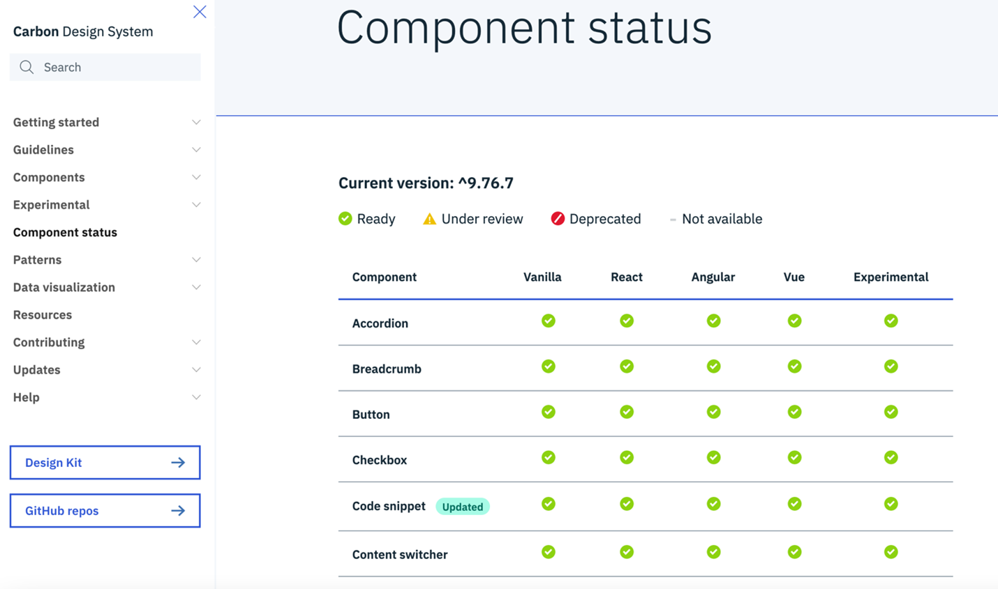
Either these changes get caught during the review process or while running your daily tasks for the product, you need to keep under control the flow of design system changes. Especially, when it comes to updates or leave out outdated, unused, or inoperative components from the system. It is really critical to have a certain place to demonstrate components’ status. A section where you can update components’ status so that it’s clear what’s available to use for everyone in your team. The component status section, in a way, reveals the lifecycle of components in your design system.
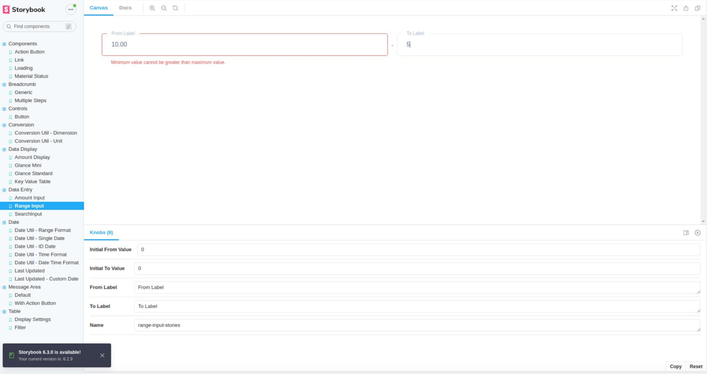
Nonetheless, it may not be feasible to set up a design system from scratch. At Commencis we cater design systems for a wide range of clients. Each one has different budget limitations, corporate culture, design process, and certainly challenges. Depending on the needs of a project, especially when the cost of maintenance outweighs any productivity benefits of design systems, we utilize tools for design systems. At this juncture, Storybook is our go-to tool for setting up a design system, but again, depending on the needs. Storybook is an open-source tool for building UI components in isolation while streamlining UI development, testing, and documentation. There are many tools on the market, such as Zeroheight, Invision DSM, Lingo, etc… However, since there is no one-size-fits-all approach for setting up a design system, you need to find out what works better for you.
To Recap
“A design system isn’t a project. It’s a product serving products.”
Nathan Curtis, the design systems expert and author of Modular Web Design
Having a UI library or a React framework is awesome, however, a true persistence of a design system relies on how well thought out its sustainability and adaptability. In my humble opinion, having a set of tactics is important as much as having a broad strategy and system principles. I tried to share some of the tactics that I found useful along the way for keeping the design system under control.
In a nutshell, as soon as the projects kick off the first step is to make a checklist which could also serve as a small-scale road map. Once your design system gains more tangible form, run a pilot project without investing too much of your time, just like a television pilot. Last but not least, have a formal maintenance process. Setting collective review sessions is a good start, and it is also a double-dipping in terms of maintenance and governance of your design system.
Reading Time: 8 minutes
Don’t miss out the latestCommencis Thoughts and News.

