Slack (also now Zara) changed its logo — love it or hate it?
31/01/2019
Reading Time: 4 minutes
If you search online for famous logo changes throughout recent times, you’re going to see some love and a whole lot of hate. In fact, people are generally not that receptive to logo redesigns, especially after they’ve already gotten used to the first one.
Most recently, Slack, Kate Spade and Zara launched their new logos shocking their fans. Slack replaced its original hashtag icon. Kate Spade changed its signature tag color from green to pink. And finally, Zara preferred to squash all the letters together in its new logo.
As a technology company using Slack as a collaboration tool, we focused on the new logo of Slack. Let’s talk:
Don’t miss out the latestCommencis Thoughts and News.
What does the new Slack logo mean for designers?
Slack launched a new logo to replace its original hashtag icon. This rebrand immediately prompted intense public reactions, from Cnet’s “Slack’s new logo is weird” to The Independent’s “New Slack Logo Proves Controversial Among Messaging App Users” to scathing Twitter responses likening the new design to swastikas.
For some background, Slack launched in 2009 and is one of the most popular tools for group collaboration today. Its original logo was a colourful hashtag symbol, which was prevalent throughout the entire software. Conversations were organised into channels that started with #, users could add hashtags to messages, and users were able to search using hashtags to produce a complete record of all the relevant content. It was an easy and fun way of managing complex and multi-level communications.
Enter the new Slack logo, now conspicuously without the iconic hashtag design and featuring a simpler colour palette:
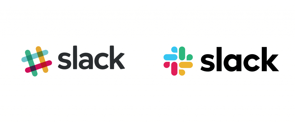
The new logo was designed by Slack’s in-house design and brand team in partnership with Pentagram, a leading design firm with offices in London, New York and Berlin. The Pentagram design lead was Michael Bierut, who is no stranger to taking high-profile creative risks. His most recent work was the Mastercard logo revamp earlier this year and he was responsible for designing Hillary Clinton’s “H” logo in the 2016 United States presidential elections.
Why did Slack change its logo?
Slack explained the rationale behind the new logo in a blog post, saying it was “extremely easy to get wrong”.
“It was 11 different colors — and if placed on any color other than white, or at the wrong angle (instead of the precisely prescribed 18º rotation), or with the colors tweaked wrong, it looked terrible. It pained us.”
In any case, Slack seems prepared to ride out the backlash. The CEO, Stewart Butterfield, tweeted that although 35% of people would react with an angry emoji to the change, most users would move on to something else in a month’s time.
Sometimes the risk of negative feedback is worth it, particularly when a company is modifying its product, service, structure or the way it does business. A logo redesign can be a way of letting the world know things are changing.
In fact, the new logo comes as Slack is readying for an initial public offering (IPO) in the second quarter. The Wall Street Journal reported that Slack was aiming for an IPO valuation exceeding the $7.1 billion it reached in its most recent funding round.
New logo or no, it looks like Slack will have the last laugh in the end.
Why so much fuss over a logo?
Clearly, some people really care about brand logos. Karen Winterich, an associate professor of marketing at Pennsylvania State University, conducted a study on people’s reactions to logo redesigns. In general, she found that the stronger people’s associations with a brand, the more negatively they react when its logo changes. In one study, Winterich asked 632 college students to respond to Adidas and New Balance logo redesigns.
Participants who had a strong affinity with the brands tended to react negatively to the redesign. Those who had weaker ties with the brands didn’t mind the logo change.
This is indicative of the strong emotional ties that a logo can forge. Often, logos are the first thing people see when they initially interact with a brand. Over time, consumers begin to trust the companies they engage with and form a natural desire for consistency in that relationship.
For designers, it’s important to create logos that represent a brand’s core identity. It’s a lot of pressure for one small image but when executed well, it can be a very effective communication tool. Chances are that you’re familiar with the golden arches (fast food chain McDonald’s), what store features a giant red bullseye (retailer Target), and what the monochrome apple represents (tech company Apple).
Logo redesigns have always been controversial
When Airbnb first introduced its new logo in 2014, there was a lot of outrage from netizens. Airbnb explained the new design as representing “the universal symbol of belonging”. The internet thought otherwise; there were unflattering comparisons made from pretzels to bear snouts.
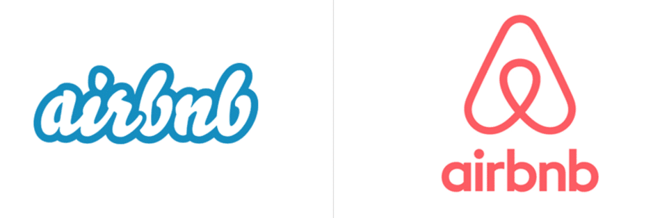
However, Airbnb stuck to its guns and even created an infographic about the public reception to its new logo, where the company showed it could take a joke and linked readers to a behind-the-scenes video of the logo redesign.
Even earlier than Airbnb was the big Starbucks controversy of 2011. The company removed its green mermaid from its circle, as well as the surrounding text “Starbucks Coffee”.
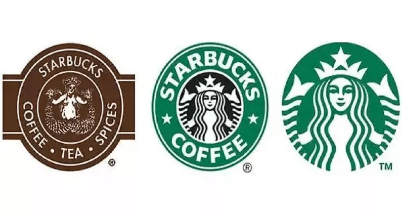
Starbucks made the change for strategic purposes as there were future plans to extend its product range beyond coffee. Once the new logo launched, the inevitable backlash ensued (comments ranged from lamenting the mermaid’s lack of personality to the design looking unfinished). However, Starbucks stood firm, acknowledged the change would take time to accept, and asked its loyal customers for their patience. Eight years later, this strategy appears to have paid off, with the Starbucks seeing a 4% sale increase in the fourth quarter of 2018.
For companies considering a logo redesign in the future, there’s clearly a lot to think about beyond just the design element. However, it’s clear that one of the key factors to quick public acceptance is transparency and being forthcoming with consumers.
But hey, if you’re still bummed out about the new Slack logo, we get it. Maybe you should take a look at these early versions shared by Slack’s design firm, Pentagram.
The new logo doesn’t look so bad now, does it?
