How Netflix’s Bandersnatch Heralds a New Era
in Digital User Experience
16/01/2019
Reading Time: 4 minutes
The importance of user insight in the new Black Mirror film
If you’ve managed to somehow avoid the internet’s frenzied hype around Bandersnatch, well done on making it this far. However, spoiler alert: We’re going to be talking a lot about Bandersnatch in this post.
Bandersnatch is the latest installment from the Black Mirror franchise and it’s Netflix’s first interactive film. It’s release took the online community by storm thanks to its Choose Your Own Adventure concept, where viewers are able to select what the protagonist does next and essentially control the film’s plot. The viewer’s choices alter the storyline at every turn, creating multiple possible endings and narratives to suit each person’s personal taste. Choices ranged from the mundane (“Which cereal to eat for breakfast?”) to the dark and twisted (“Should I get my rabbit from Dad or kill him?”).

Source: The AV Club
Viewers not only have a say in how their version of Bandersnatch will play out but Netflix now also has a say in what type of content they’ll see in the future. Every single decision made in Bandersnatch has been logged with Netflix to further develop its user profiles, enabling the streaming provider to sell even more individualized content in the future. Yes, thanks to that one scene in Bandersnatch, Netflix now knows whether you prefer Sugar Puffs or Kellogg’s Frosties.
Don’t miss out the latestCommencis Thoughts and News.
Importance of User Insight
This may appear a bit creepy in the light of Bandersnatch’s grisly and dark themes, however, companies have actually been optimising the user experience for years through insight gathering and big data. In a way, users have a say in product experience design with their interactions. And this is done through a range of design techniques.
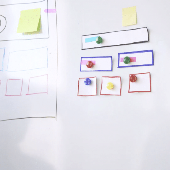
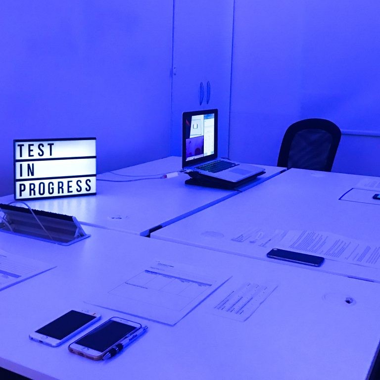
One of the most popular methods for gathering user insight and optimizing the experience is A/B testing. A/B testing allows you to test multiple versions of a product proposition in order to see which one performs better. Users are divided into two groups and each of them is shown different variants. One half sees version A and other sees version B.
Make no mistake – here we don’t suggest that Bandersnatch is in the business of A/B testing. We just want to emphasize the power of data and user insights, and how it optimizes the experience. While users can choose and create their own experience in Bandersnatch, it is not the case in testing process. They can only interact with the product in a version which is presented to them.
This kind of design methods helps clients understand the reality of how customers are actually interacting with their services or products. It is also quantitative way to decide which experience your users truly prefer.
Here’s a list of elements often chosen to be tested:
- Call-to-action buttons (size, colour, colour, content)
- Headings and subheaders
- Landing page images and text
- Promotions and offers Page layouts
- Web forms Copy (length, placement, and content
- Visual assets (videos, GIFS, etc.)

And the list goes on! Almost anything can be subject to an A/B test, even once it’s launched – in fact, especially once it’s launched. Features and projects can continuously be optimised throughout their lifecycle to keep up with ever-changing customer expectations.
The details smoothed out in A/B testing will have an enormous UX impact on the overall product or service. For example, have you ever realised how easy it is to navigate your favourite mobile apps? Most popular apps don’t start out like this. Instagram was originally launched as a completely different concept under the name Burbn (one of the founders was a whiskey fan). On Burbn, users could make future plans, document their social lives, share photos, tag their location, and even earn points for seeing friends.
Confused? You’re not alone. Most people thought the app had too many features and was overly complex to use.
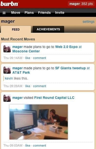
Burbn screenshot from Famous First Landing Pages
Burbn needed to be decluttered but what could be cut? The answer was in the UX data, which showed that people were posting photos on Burbn after running them through a photo filter app. The founders of Instagram honed in on this opportunity and created a new app that only had one purpose: Posting filtered photos.
In reality, this process took several months of prototyping and experimentation. The founders refined Instagram over and over, analysing how Burbn’s users were gravitating towards photo-sharing and studied every popular photography app, taking particular note of Hipstamatic’s filters. After this period of intense testing, Instagram launched in late 2010. The app hit one million users in three months and the rest is history.
The most successful companies have products and services that are intuitive and easy to use. It doesn’t matter whether it’s a mobile app, software program or Netflix interactive film. Companies that listen to the data and adapt their UX to their audience’s needs – not just once, but time and time again – will earn their customer’s loyalty and trust.
What do you think about the future of UX design? Do interactive films like Bandersnatch showcase its future potential? Or are we all just living in a Black Mirror episode?