Well, We’ve Made Our Own Fonts Alright
20/02/2019
Reading Time: 3 minutes
In a hot June day, I found myself teaching the basics of font design to my colleagues, here at Commencis. This article is about my experience throughout the design workshop.
Note that I am not an expert on font design, just a font geek.
Seems Easy at First

Even before I became a visual designer, I’ve always admired fonts. For me, a font is the best tool for visualization of spoken words, and this resembles me of noises played in the right order, which is called music. As a music producer, I’ve created a font for expressing my music, called GrainsType, which contains unique shapes for each letter. By using it as randomized, I am able to express the complex emotion of the lyrics and the fusion of sounds in my tracks.
As I started off the creation process of GrainsType, thought it was gonna be easy. I wanted to make a font out of random geometrical shapes, which I would’ve drawn while listening to my music. In the end, I had just about 70 characters ready to digitize. I’ve scanned and vectorized my characters in FontLab and that was it. However, this was an experimental project. GrainsType in action
Don’t miss out the latestCommencis Thoughts and News.

Before I’ve created GrainsType, I took typography classes back in college. In the meantime, I’ve attended a couple of font design workshops, led by professionals. In those workshops, I got familiar with Glyphs and FontLab to create actual fonts. Since I was really into it, I’ve decided to share my knowledge to my friends in a series of workshops: Make Your Own: Font
Note: I am planning to do another “make your own” workshop in another extent, so it might become a workshop-series after all!
The participants were going to:
- Decide on a theme
- Draw the shapes for the font on paper or in a vector-based app like Adobe Illustrator, Glyphs, etc.
- Scan and digitalize everything (if they’re on paper)
- Create the font in Glyphs app
- Review everything and export your font (give it a unique name)
- Test it in Adobe Illustrator
I Like Naming Things So, Let’s Call This One: Session A
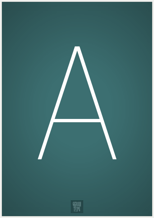
Nervous. Maybe not. As I took a sip of Zero on that mug, I was ready to teach the basics. The participants decided on the kind of font they wanted to create, which would set the theme of each of their fonts. There was no limit of creativity and it was up to them to draw letters or totally abstract shapes. There are numerous ways of reading a text written with a font. A capital “A” letter could emphasize a man with an astronaut suit or an abstract shape which symbolizes “hope”, or it could be just a shape which looks like the letter “A” (in the end, they all went with monospace letter fonts).
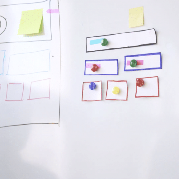
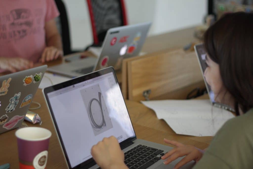
Some snapshots from Session A:
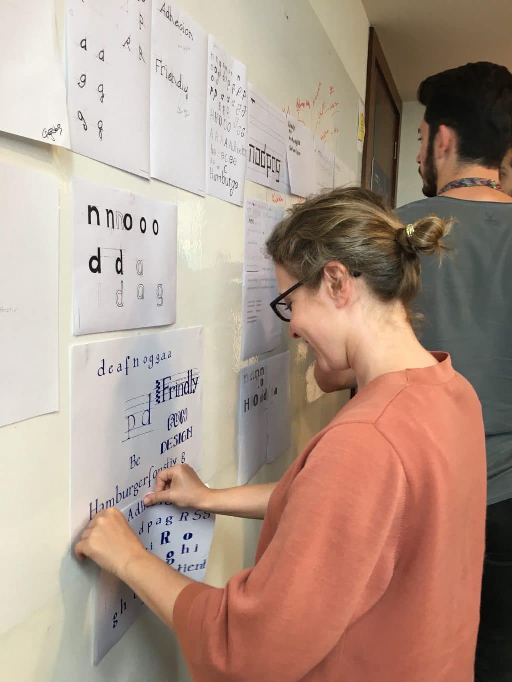
Getting ready for review
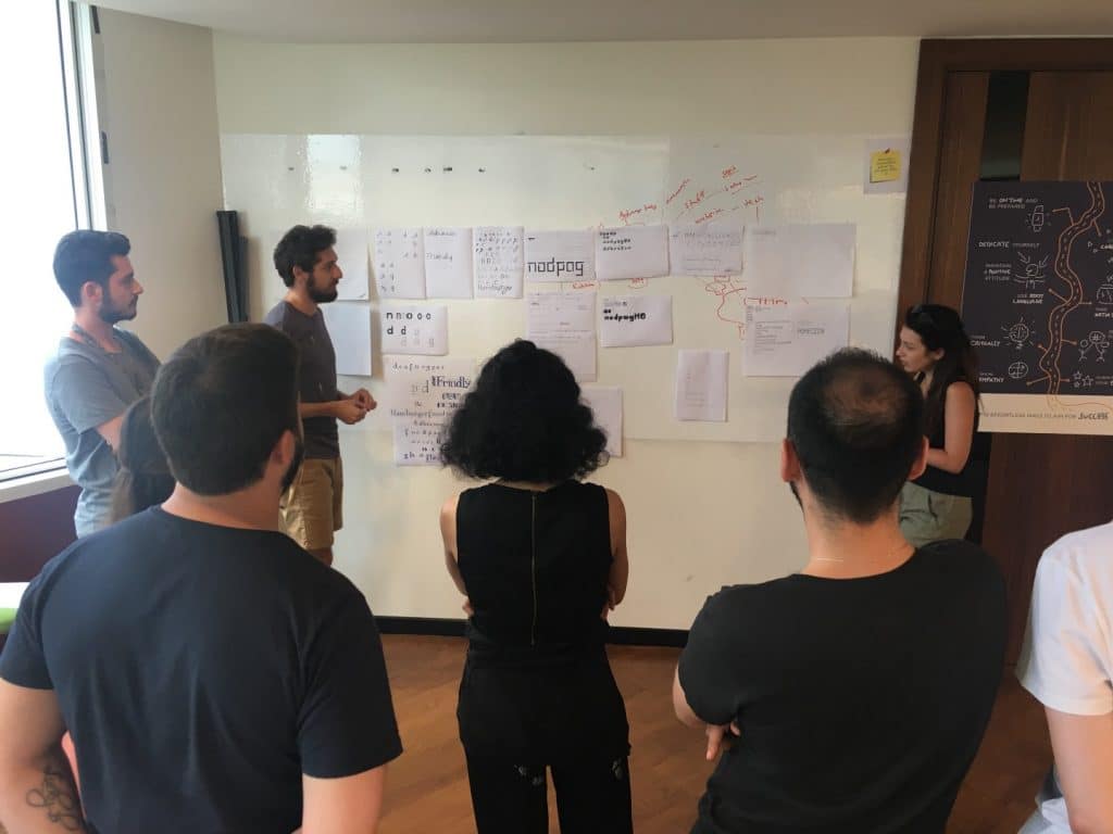
In review
Because we had a limited time, their homework was to finish designing small-caps, all-caps and numeric letters until next session. The review was so great that everyone stood up and explained their font’s theme and style. There was a lot of variety.
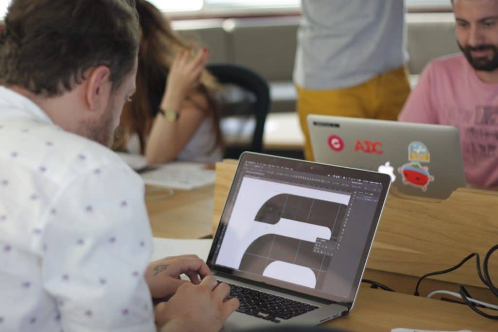
Here Comes the Boom — Session B
After one week, it was time for Session B, digitizing the drawings. After we scanned everything, we used Glyphs to outline and fill the shapes. It was a bit tricky for everybody to get used to the app but they caught up very quickly. If you want to learn more about digitizing scanned drawings in Glyphs, Glyphs’ own website has some great tutorials here.
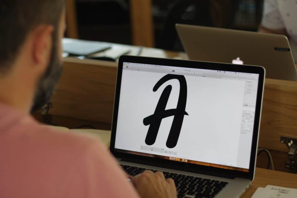
After most of the characters were successfully digitized, everybody gave their font a unique name and tested them out in Adobe Illustrator.
The feedback from the students were great, they told me it was informative enough to create a limited version of their fonts. Maybe in the future they would even design a typeface, who knows?
That’s All Folks! ‘Till Next Time!