Designing for the Next Wave: Our takes on WWDC and Google I/O 2025
Reading Time: 7 minutes

Ebru Namaldı
Senior DesignOps Manager
Apple and Google’s 2025 developer conferences introduced fundamental changes that will reshape how we build mobile (and beyond). It will challenge us to respond with platform-native design fluency, AI readiness, and collaboration across the entire SDLC.
The future of digital product design is moving fast. Here’s what stood out to us at Commencis and how we’re thinking about the road ahead. This is not just a summary of change it’s a shared map of where we go next as teams, including useful takes and tips for further steps.
Here we go.
Part 1: Major Design Updates
Apple and Google are reshaping the platform-level UI design paradigm. Interfaces are now fluid, context-aware, and intelligence-driven — changing how we design, build, test, and deliver user experiences.
Apple’s Liquid Glass
Apple introduced its broadest design update ever, called “Liquid Glass“, a unified design language across all Apple platforms. (iOS, macOS, watchOS, tvOS and beyond.) Elements now have translucent, glass-like properties full of droplet animations, light, depth, and 3D parallax effects with the new design language. While it elevates aesthetic richness and spatial interaction, the new system also brings important accessibility considerations that teams must carefully navigate through.
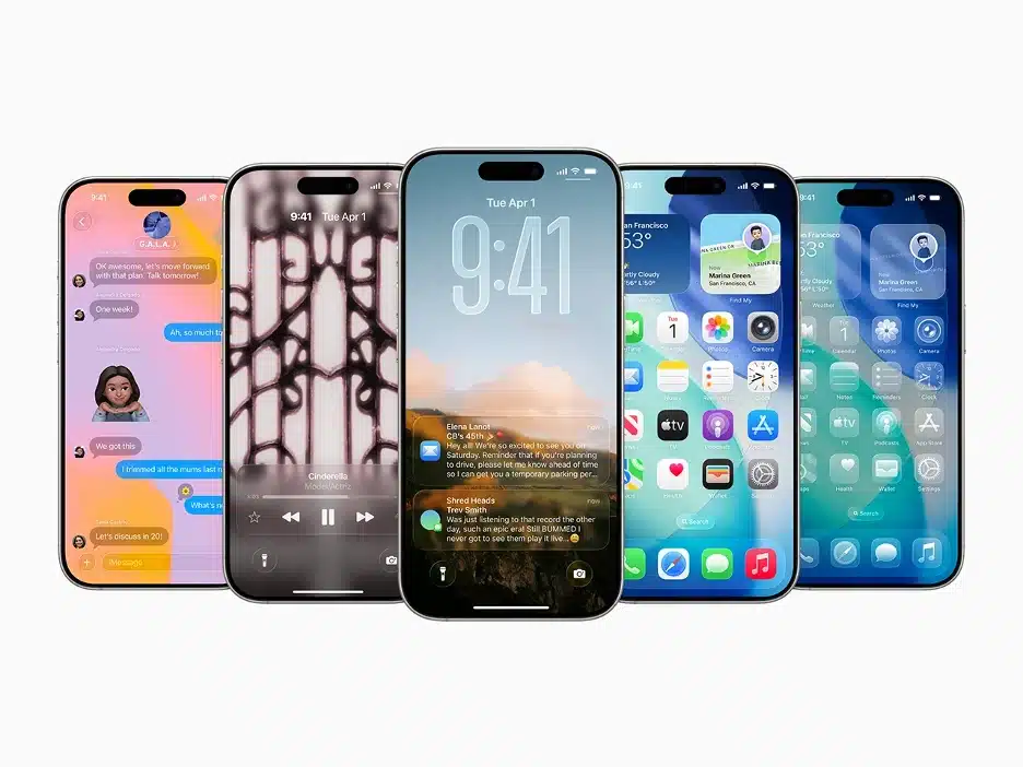
“It combines the optical qualities of glass with a fluidity only Apple can achieve, as it transforms depending on your content or context.”
Highlights
- The biggest cosmetic update since iOS 7’s Flat Design, introduced in 2013.
- The design refresh is inspired by Apple’s VR headset, the Vision Pro.
- Glass as a dynamic surface, not just a visual style — it reacts to scroll, light, and system color.
- Unified design language and context-sensitive behavior across all platforms for a consistent experience.
- Renewed controls, navigation models, app icons, contextual toolbars, widgets, and more.
- Revamped system experiences, such as Lock/Home Screens, Notifications, Control Center and more.
- Q3 2025 implementation planning, with rollout in Q4 2025.
- Version name: “OS 26” – Numbered by release year.
Designer’s Take
- Audit current UI components for transparency and depth options, as well as micro-interactions.
- Evaluate the usability and accessibility implications.
- Ideate personalization features through adaptive layouts, widgets, AI assistance, and more.
- Experiment and prototype glassmorphic effects until the new UI Kit is published.
- Get ready to update design systems to include Liquid Glass tokens and variants, defining and revamping component rulesets (what floats, anchors or animates)
- Redesign layered app icons to adapt to dark mode, light mode, or colorful tints.
- Collaborate with engineering teams to ensure performance and consistency across systems.
Dive deep into:
Developer’s Lens
- Performance on Older Devices:
- Liquid Glass heavily relies on GPU acceleration, optimized primarily for modern Apple Silicon. Older hardware might struggle, leading to degraded visuals, reduced animations, or increased power consumption.
- Complexity of Custom UIs:
- While Apple’s standard UI components adopt Liquid Glass easily, apps with heavily customized interfaces may require substantial refactoring or redesign efforts, potentially increasing development time and costs.
- Accessibility Challenges:
- The translucent and reflective nature of Liquid Glass can impact readability and usability, especially for users with visual impairments or cognitive sensitivities. Developers must carefully manage contrast ratios and test extensively to maintain accessibility.
- Compatibility Mode for Gradual Adoption:
- Apple provides developers a temporary bypass to the Liquid Glass design via the UIDesignRequiresCompatibility key in your app’s Info.plist file. By setting this property to YES, developers can retain the pre-Liquid Glass UI during initial development and testing phases. This allows teams adequate time to gradually adjust and optimize their apps for Liquid Glass without immediate pressure to fully adopt it.
Dive deep into:
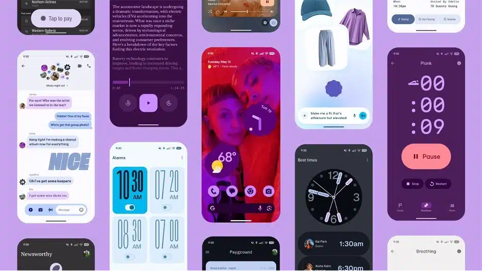
Google’s Material 3 Expressive
Google, on the other hand, introduced the evolution of the Material 3 design system. It’s a set of new features, updated components, and design tactics — and a new look and feel.
“M3 Expressive isn’t a new version of the system. We’re not deprecating M3, and this isn’t M4.”
Highlights
- The most researched update to the Material Design System since its launch in 2014.
- Extensive 3-year-long user research: 46 studies with more than 18,000 participants.
- Vibrant colors, adaptive components, flexible typography, and shapes.
- More emotional, personalized, and engaging UX.
- 15 new or updated components, new motion physics system supporting more characterful animations.
- Version Name: “Android 16” – Dessert names are gone.
Designer’s Take
- Audit and refresh design systems with Expressive M3 tokens and variants.
- Tackle with motion and depth models, experimenting with tokens for blur, motion, elevation, and theme semantics.
- Experiment with new design language, including shapes, motion physics in Figma by reviewing the M3 library.
- Investigate motion patterns in core components and rethink feedback behaviors — animations are no longer just polish, they communicate state and intent.
- Review the M3 Expressive User Research insights. (A true gem for researchers.)
- Ideate on adaptive patterns, AI-enabled flows and suggestions.
- Collaborates with engineering teams to ensure performance and stability.
Dive deep into:
Developer’s Lens
- Faster Implementation of Complex UI
- Google now provides ready-to-use expressive components (e.g., segmented buttons, animated loading indicators). These allow our team to build sophisticated interfaces faster and more consistently, with fewer custom design efforts.
- 💡 Why it matters: Reduced development time and fewer bugs when using standardized, expressive UI building blocks.
- Good Design–Development Collaboration
- With the expressive design system, design specs and code are more aligned. Tokens for color, shape, and spacing now match exactly between design tools (like Figma) and the development environment.
- 💡 Why it matters: This minimizes guesswork and speeds up implementation — resulting in fewer revisions and stronger visual fidelity.
- Built for Adaptability and Accessibility
- Material 3 Expressive components adapt automatically to light/dark mode, screen sizes, and user preferences like reduced motion. This ensures accessibility and consistency across all devices — phones, tablets, or foldables.
- 💡 Why it matters: One design scales across many devices, and supports inclusive user experiences without extra effort.
Dive deep into:
Part 2: Shifting Expectations
Apple and Google have redefined expectations for how users interact with digital products: deeper emotional connections, seamless adaptation across devices, and AI-powered intelligence embedded directly into the experience.
Emotional
Design is no longer just functional — it’s emotional. Modern UI systems like Apple’s Liquid Glass and Google’s Material 3 Expressive layer feelings into interaction through motion, transparency, and depth.
✨ Visual languages evolve. Interfaces are no longer passive shells — they are intelligent partners in the user journey.
Designers POV
- Apple’s Liquid Glass encourages depth layering: floating modals and contextual overlays should “breathe” with subtle blur and light shift.
- Material 3 Expressive enables UI states to flow through animated shifts — not just static feedback. Personality-rich motion is enabled too, and is worth trying.
Adaptive
Users don’t stick to a single screen anymore — from phones to tablets, foldables, wearables, and XR. Layouts must now be context-aware, scaling not only in size but in relevance.
✨ Adaptivity is the new standard. Layouts, tokens, components must adapt across devices, languages, and interaction modes.
Designers POV
- With Jetpack Compose Adaptive, a dense data table on desktop transforms into stacked cards on mobile, without losing clarity. Same data, different structure.
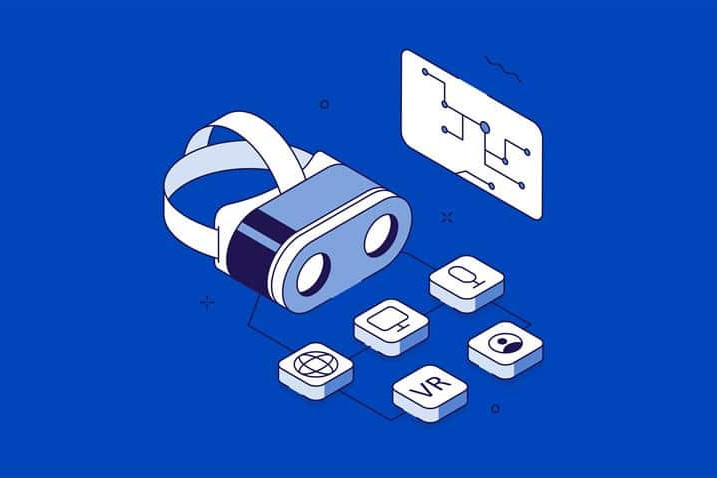
- In spatial platforms like VisionOS, we now need to think in 3D space — not just screen coordinates. It requires clear z-axis intent in our design files. What floats? What folds? What fades?
Developer’s POV
- Jetpack, composition is adaptive:
- On large screens, the system will ignore certain configuration settings that apps have traditionally used to control layout and screen behavior, such as:
- Locking a screen to portrait or landscape
- Preventing screen resizing
- Forcing specific aspect ratios
- On large screens, the system will ignore certain configuration settings that apps have traditionally used to control layout and screen behavior, such as:
- Android Edge to Edge: Starting with Android 16 (API 36), Edge-to-Edge becomes mandatory for all apps targeting this version.
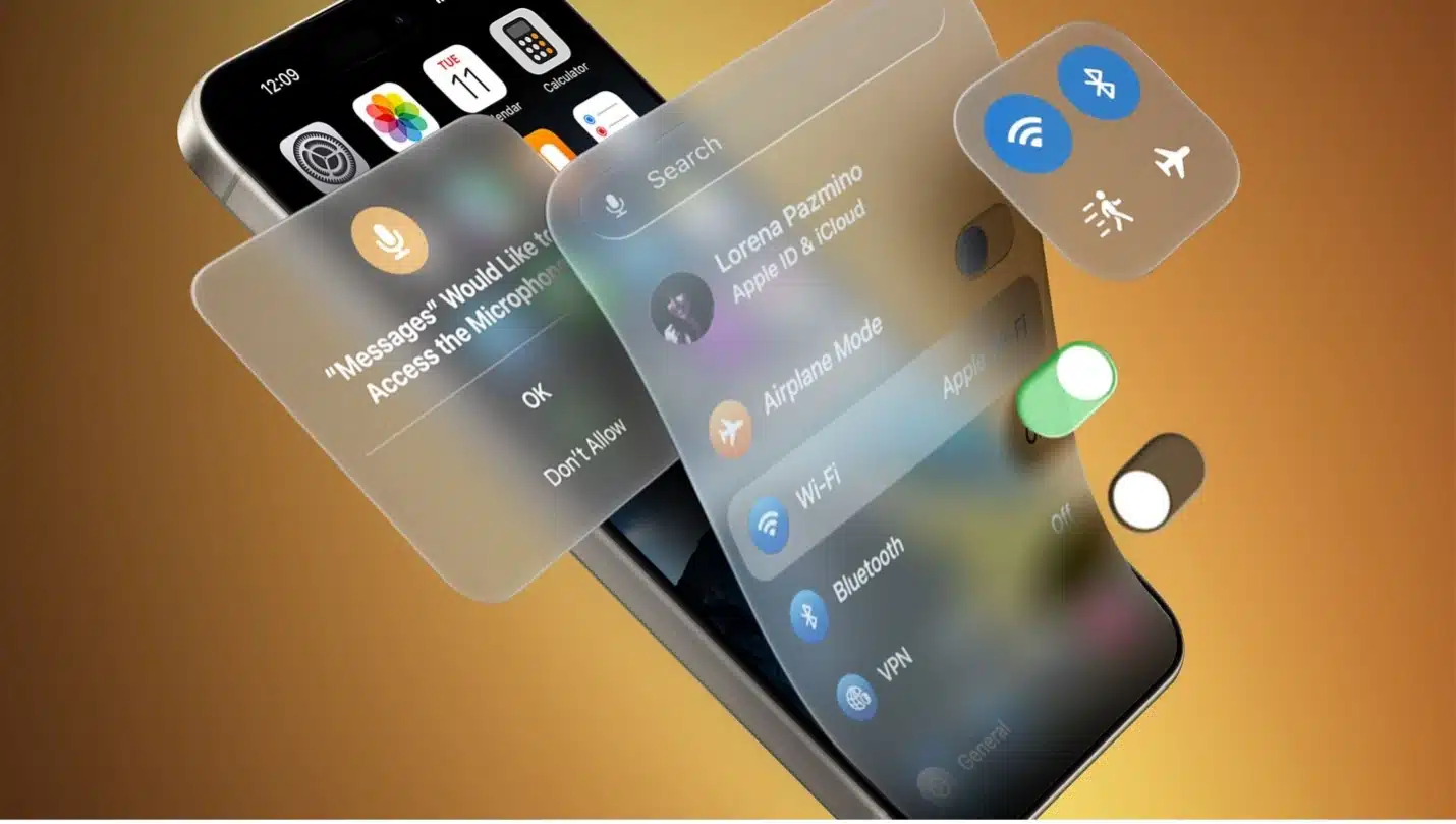
Intelligent
AI is no longer a tool behind the curtain — it’s a UX co-pilot. Interfaces must now sense, suggest, and support without waiting for user intent.
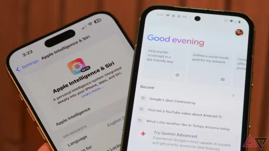
✨ AI is now native. Apple Intelligence and Gemini 2.5 bring smart summarization, live translation, and content generation — directly to the device.
Designers POV
- Auto-generated summaries, AI-translated content, suggested actions, predicted inputs, pre-filled data, generated images… More ideas.
- Generated content (summaries, images, suggestions) must have appropriate framing, and should anticipate contextual behavior. For each, rethink user permissions.
Developer’s POV
- Foundation Models framework (Apple Intelligence API)
- Apple opened direct Swift access to the ≈3-billion-parameter on-device language model that powers Apple Intelligence, packaged as the new Foundation Models framework
- Xcode 26 “Code Intelligence”
- Code Intelligence brings an LLM-powered assistant into Xcode: natural-language prompts generate Swift / Objective-C code, tests, docs, or refactors inline; it can also autocorrect compiler errors and suggest architecture tweaks
- Gemini Nano + ML Kit GenAI
- Private, on-device APIs (summarize, proof-read, rewrite, image-describe) powered by the new Gemini Nano model running inside Android 16’s AICore service—no server calls, <10 ms latency.
- Gemini in Android Studio
- LLM assistant adds Journeys (prompt-based UI tests) and Version Upgrade Agent (auto-updates deps); plug-in system lets teams swap in other models while keeping code context local.
🤘 Many thanks to Oğuz Gürler, one of our Engineering Managers, for bringing technical insight and thoughtful perspective to this report.
Key Takeaways
These updates from Apple and Google show us a future that’s more intuitive, expressive, and intelligent and it’s arriving fast. As new standards for motion, transparency, and AI-driven UX emerge, the risk of design and technical debt increases dramatically.
At Commencis, we’re aligning our design systems, engineering pipelines, and product strategy to meet this shift head-on. As platforms evolve, so must we not individually, but as one integrated team.
Whether it’s AI-driven interactions, adaptive experiences across devices, or immersive motion design, we’re investing in experimentation and collaboration to stay ahead and to help our partners do the same.
Reading Time: 7 minutes
Don’t miss out the latestCommencis Thoughts and News.
Ebru Namaldı
Senior DesignOps Manager