Design Trends That Stand Out
17/08/2018
Every year as Commencis Design Team, we make these observations about design trends, but for the first time, we publish it online.
I hope you enjoy it.
Our research resulted with 16 different trends:
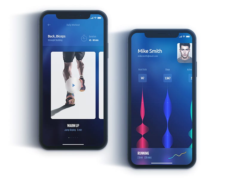
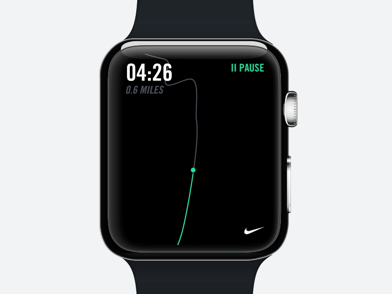
1 – Contextual Feedbacks and Microinteractions
2 – Content Focus
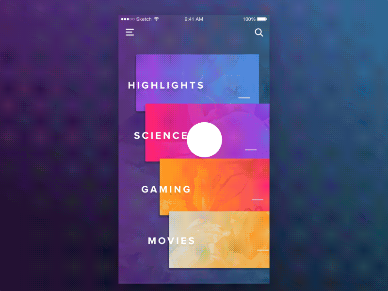
3 – Visible and Accessible Navigation
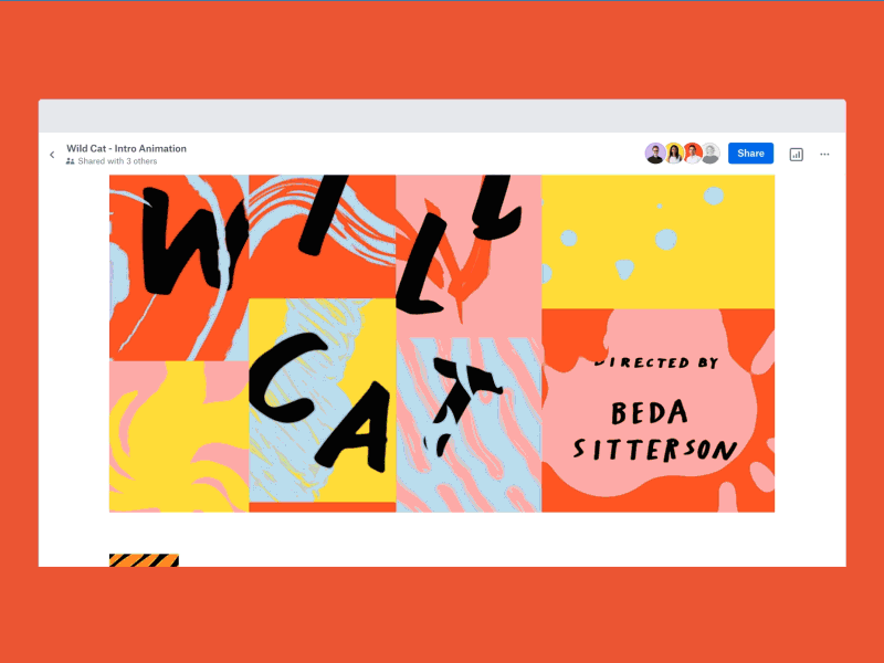
4 – Visual Storytelling
5 – Custom Illustration
6 – Semi Flat Design
7 – Vibrant Colors and Gradient
8 – Bold Typography
9 – Experimental Layout
10 – Physical Interaction
11 – Mixed Reality
12 – Conversational Interfaces
13 – Visual Assistance
14 – Importance of Microcopy
15 – Anticipatory Design
16 – Optimised Interstitial Anxiety
Let’s dive in..
1- Contextual Feedbacks and Microinteractions
Contextual feedbacks and micro-interactions provide users with a clear feedback about the platform status when transitioning between screens.
We want our users to focus on one thing at a time. We got a story to tell, so we should guide the user as we tell it.
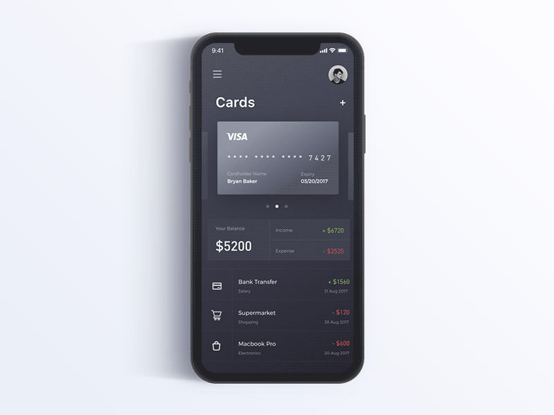
Using motion is an increasingly popular trend to give feedback on platform status and communicate the results of user actions.
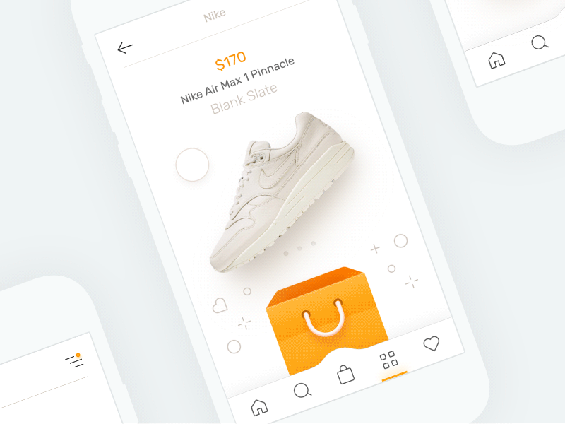
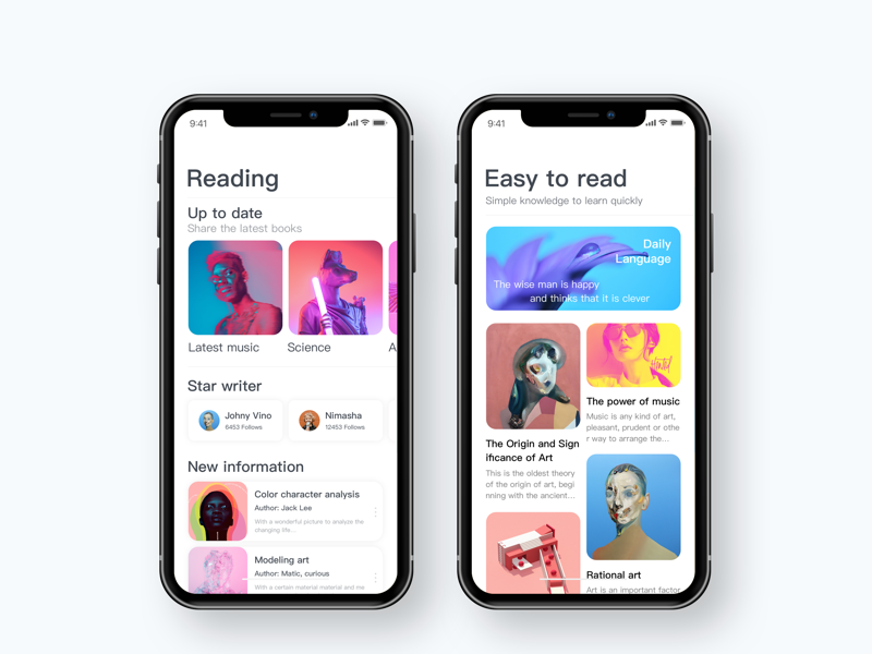
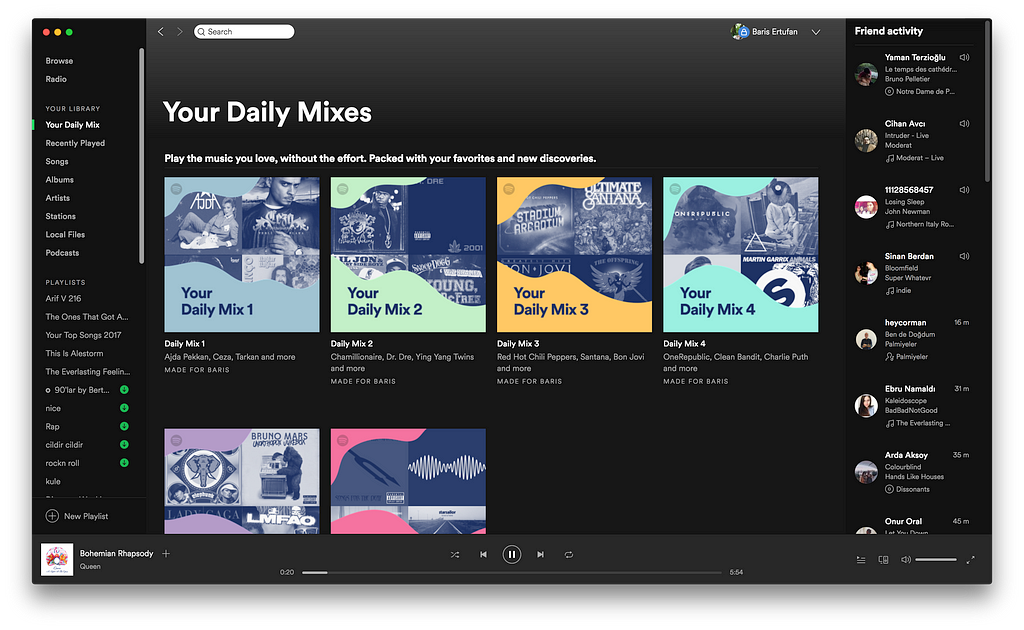
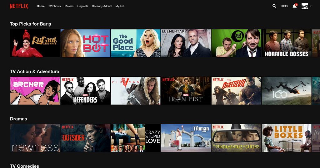
2- Content Focus
Product photographs presented in the store is the most important factor in deciding buying or not buying.
E-stores wants maximum attention on products so they use unique photographs with hitting typography.
When we design for big companies, they want every possible information to be shown in 1 screen. Clients don’t care about the cluster. We as designers, always put human in the center. We want them to feel confident, relaxed, and choose for themselves (but we motivate them in the right direction 🙂 )
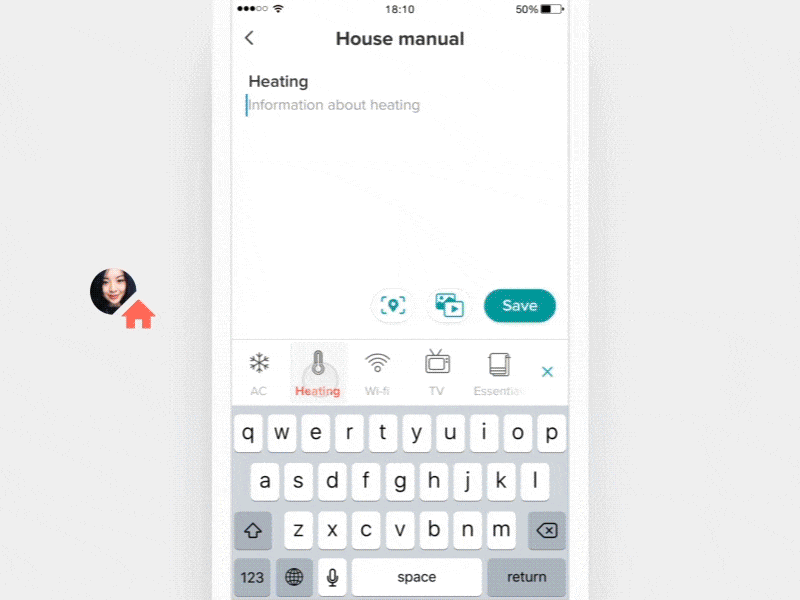
3- Visible and Accessible Navigation
It is crucial to have a navigation that is always visible and accessible on the screen.
If your app has a large and complex content, tab menu structure is good for you. Grouping your content is not an easy process, but once you do a good job, your users become much more happy.
If your app only focuses on 1 thing, you may hide the legal gibberish, settings, logout button, etc.. under an hamburger menu.
Most known apps uses tab menu now because its really transparent to the users, and also easy to navigate.
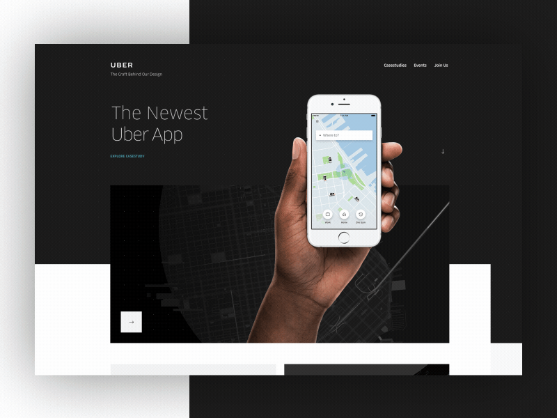
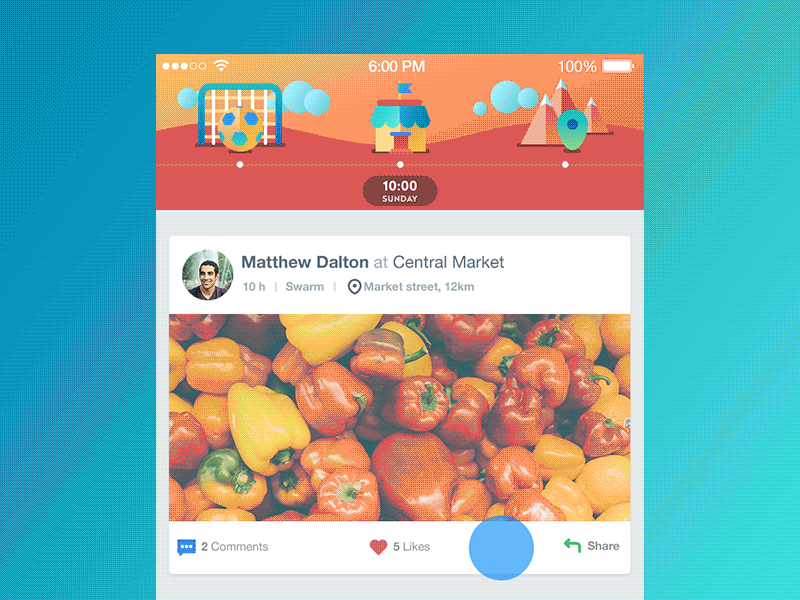
4- Visual Storytelling
Internet has quickly taken over by fast and simple storytelling. Big players such as Facebook, Instagram and Whatsapp are giving more importance to instant video sharing to encourage levels of engagement.
To truly understand this trend, we first have to understand the history behind it.
Books > Movies > Social Media > Tweets > Photos > Stories
- First documented storytelling started with books.
- Then when movies appeared, people adapted extremely quickly, because it was easier and faster.
- Then came the social media era. People started to share their stories.
- MSN messenger showed what music that you are listening, Facebook showed what are you doing or feeling. Then Twitter came up with the very short written stories.
- With Instagram, photo sharing era has begun. Photos tell stories without even losing time with the reading.
- Now, we are at the final stage, the “short videos that disappears after one day” era a.k.a the stories.
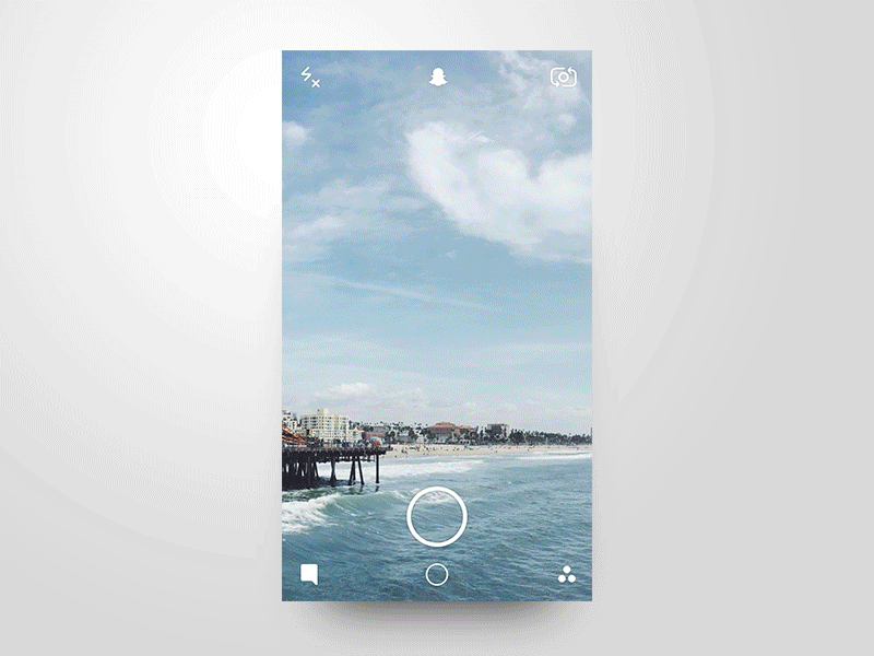
“But my app is not a social media app, how can I implement this trend?”
Stories can be used in many ways, every on-boarding can be a story; every progress of a function in your app can be a story (Depending on how you want to display it), every splash screen can be a story.
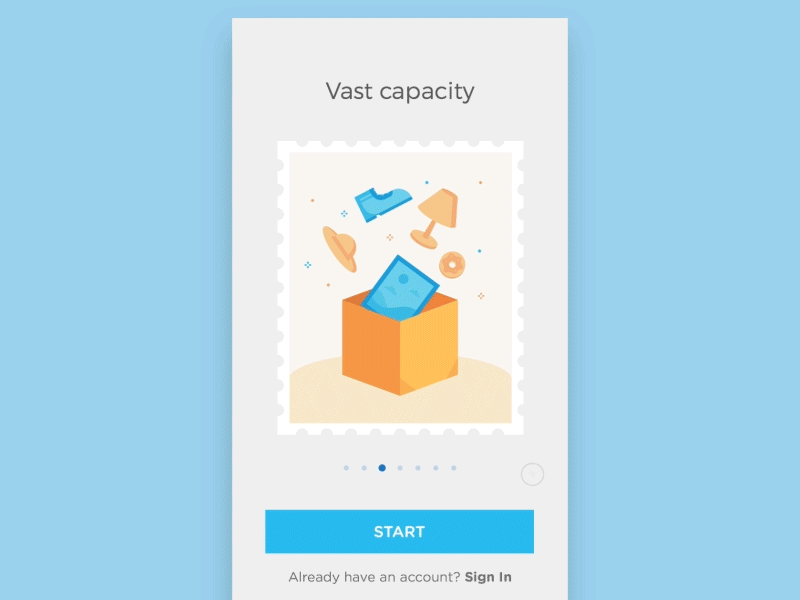
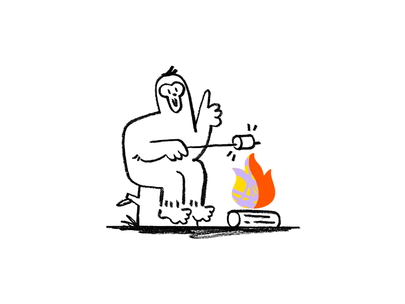
5- Custom Illustration
If you want a unique looking website or app that any visitor will remember; custom icons and graphics could be your primary assistant.
Big companies such as Google, Dropbox, Facebook, among others adapted this trend already. They created a visual illustration language for themselves, which resulted beautifully. Whenever they create a mini website (for woman rights, against cancer, etc.), they conserve this visual language, and users that visit their website, subconsciously understand the origin.
Take Dropbox for example — Hand drawing puts the user at ease, appeals to the child in all of us, and makes the product seem more accessible and familiar.
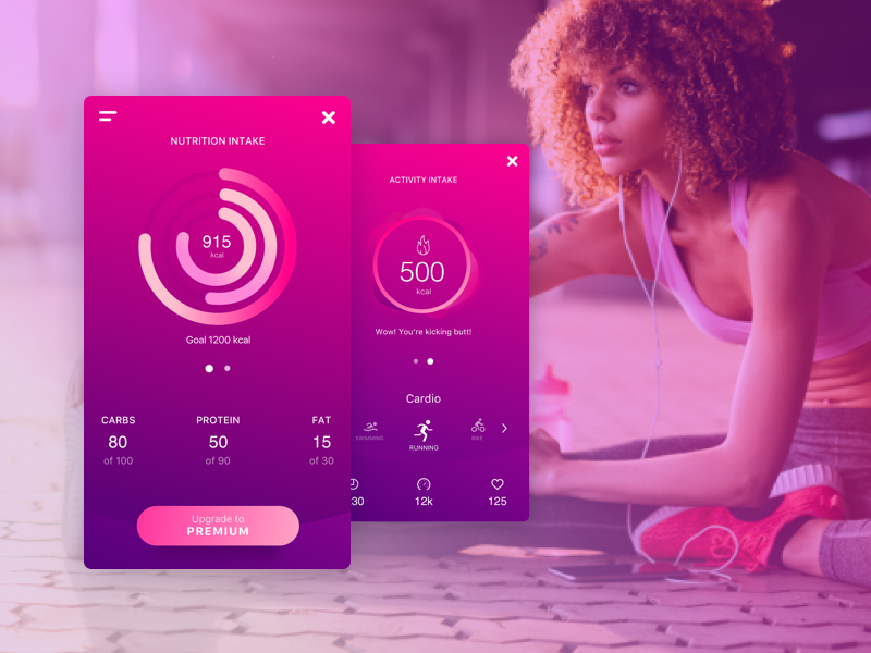
6- Semi Flat Design
By comparison with semi-flat design to flat design, affordances are more understandable with the usage of familiar tactile attributes and shadows.
Another design history lesson coming up:
Smart phone mobile app design started with skeuomorphic design. If you don’t know what it is, see here. Extremely realistic looking mobile apps.
Understanding that this is a digital screen, and we don’t have to make these so realistically, a new era has begun: Flat design.
Flat designs had some problems with readability. So, Google created the Material Design. We still use flat design elements but shadows, and layer positions act as real life objects.
Now it’s the era of Semi Flat Design. This is the era of motion and focus. We want our users to focus on what’s important. So, we use shadows at objects that matter. Depth is given by motion and shadow. Shadows are not as dramatic as Material Design.

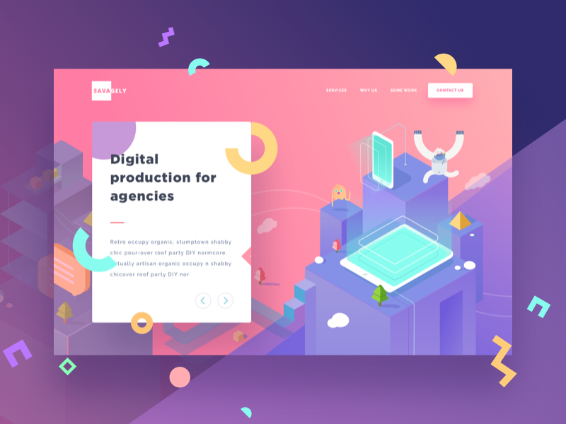
7- Vibrant Colors and Gradient
There will be more brands shifting away to bolder and brighter colors since bright colors tend to catch our attention and generate more positive emotions than dark or neutral colors.
Bright, vibrant colors are always fun, energetic and alive while pastel ones are more relaxing and discrete.
Apple music is one of the pioneers of this trend. They merged the meaning of the vibrant colors and gradients with living an active life and being healthy.
8- Bold Typography
Well-designed typography catches users’ attention and conveys the message instantly. This helps designers in quick and dynamic presentation of information.
This is where the importance of content writers shows itself. You cannot throw around long words if you want to adapt to this trend. That’s why you need a good content writer to find better words for your titles.
This has been a trend for a long time but with iPhone X, it regained it’s popularity.
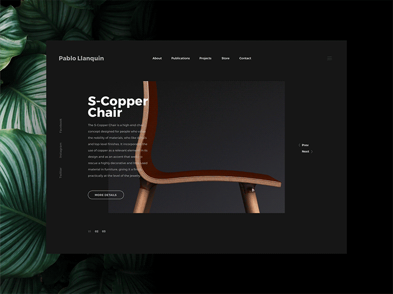
9- Experimental Layout
Experimental layouts are a good way to add some diversity and enlighten the sense of art.
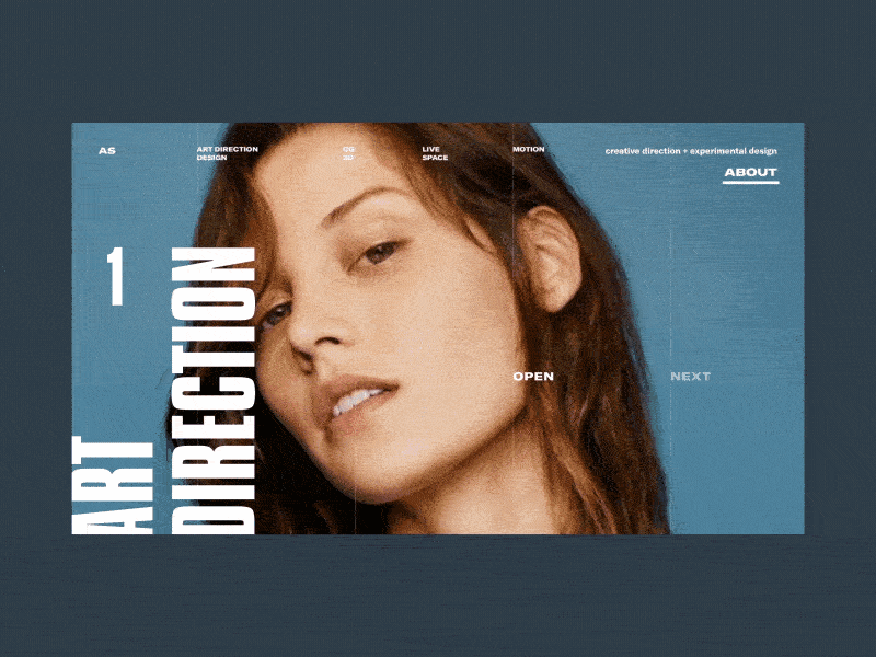
Websites are currently place for this experiment, with horizontal scrolls, use of web GL, new way of transition animations, etc.
10- Physical Interaction
5 senses are seeing, hearing, tasting, smelling, touching. We use seeing and touching mostly, and sometimes hearing. We touch phone screens. This trend explains how phones touch us back. It’s called Haptic Feedback.
This interaction actually started with PS4, XBOX, PSP controllers. When you score a goal, or crash in a car game, the controller vibrates. This gives you an extra sense of the game.
Haptic feedback is now used by many mobile apps, even by App Store.
Haptic feedbacks can help designers for orienting users to take actions like “buy”, “share” or “follow” something. They are also useful for calling user’s attention to a piece of content.
11- Mixed Reality
With mixed reality, objects from both worlds can merge with advanced sensing and digitising technologies, enabling users to experience real life surroundings and the virtual world together.
We talked about this trend for many years but in 2018, the tech behind it is finally become promising. There are now some VR gaming places appearing around town.
12- Conversational Interfaces
Conversational interfaces are in fact systems that resemble the feeling of human-to-human interaction when communicating via platforms.
When we use this word, clients mostly think of chatbots. Conversational interface covers many things among chatbots. Siri is also a conversational interface. Your app doesn’t need these to adapt conversational interface though.
Another way to follow this trend is to chang the tone of voice in your app. For example: You have an input field to ask the user for his/her name. You can say “Name”, but you can also say, “Please write your name here”. This tone of voice is usually a better way to connect to your users.
13- Visual Assistance
Content based apps need to have strong visual language and not every user can handle this by their own. So, big companies use Visual Assistance to maintain this language.
Instagram > Filters
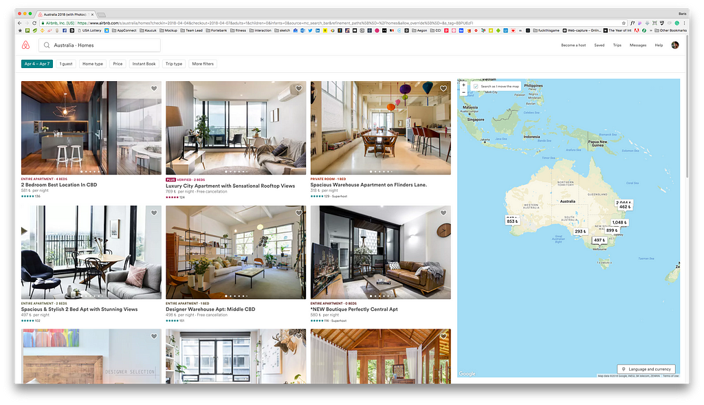
Airbnb > Professional Photographers
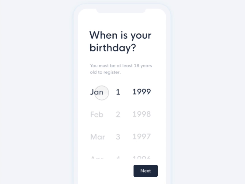
14- Importance of Microcopy
Microcopy is a relaxing moment for a user. Users sometimes get lost and content writers are here to fix that :).
A microcopy is used when a user needs direction. We, as designers need to show the right way with some words.
15- Anticipatory Design
Anticipatory design is a big leap for user experience design. It minimises the mental load and decision fatigue for users by making informed decisions on their behalf, based on their past choices.
16- Optimized Interstitial Anxiety
This is the era of speed. Users have no toleration for waiting whatsoever. So the problem is, how can we wait for the services to be loaded without users realising that they are waiting.
Loaders are really important for this trend. I don’t only refer to repetitive loaders, exact opposite actually. These repetitive loaders causes anxiety in users. They don’t know when will it end and what screen they will see eventually.
Don’t worry, there are solutions:
– Skeleton layout loading (Personally I don’t like it but still it works)
– Only showing the loader in the component that has loading problem
– Creating an interesting animation, where user can watch
– Explain exactly what you are loading and show progress
Authors note:
You cannot use every trend in your app or website. You have to learn who your users are, create personas and act according to them. Use some of the trends.
Do not overkill please 🙂
P.s: This article is a result of Commencis Design Teams’ research. (I got many help from my lovely team ?).
![]()