Supporting The User Experience with Motion
11/03/2019
Reading Time: 4 minutes
While designing interfaces for digital screens it’s important to think about the states and transactions between scenes and how these will integrate with each other. As we dive deeper into the navigational realms of a digital product, motion helps us understand the relationship between states and leaves us a trail so it’s easier to navigate throughout the final product we’re designing.
Motion brings digital products to life. We can improve something as simple as tapping a card to reveal it’s details by adding a simple scale effect where shared elements move to a new position on the screen or by adding a simple transition.
Don’t miss out the latestCommencis Thoughts and News.
If this transition wasn’t there and we just cut to its detail screen, the user would probably get lost and have a hard time figuring out where they are and get frustrated every time we introduced new content. We should always consider ways of guiding the user between two states with a clear intention.
Back to frame one
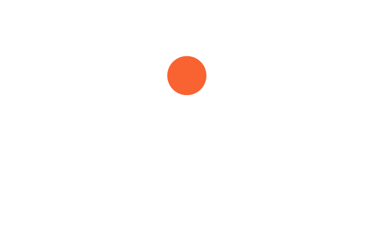
To understand animation we need to know a little bit about how animation was discovered and how it evolved into today’s moving images. An animation is the illusion of movement by arranging still pictures over a certain amount of time. In the 1800s a gadget called phenakistoscope was invented, a disk with narrow slots that could spin on a stick. These disks were used in front of mirrors. The reflection made it seem like the illustrations on the disk were moving. It allowed users to experience these short animated clips, just like today’s animated gifs. Think as this circle being a timeline, every square is a keyframe and as we spin the wheel with a certain speed as a result we see an illusion of a moving picture.

A phenakistoscope in action
Understanding the timeline
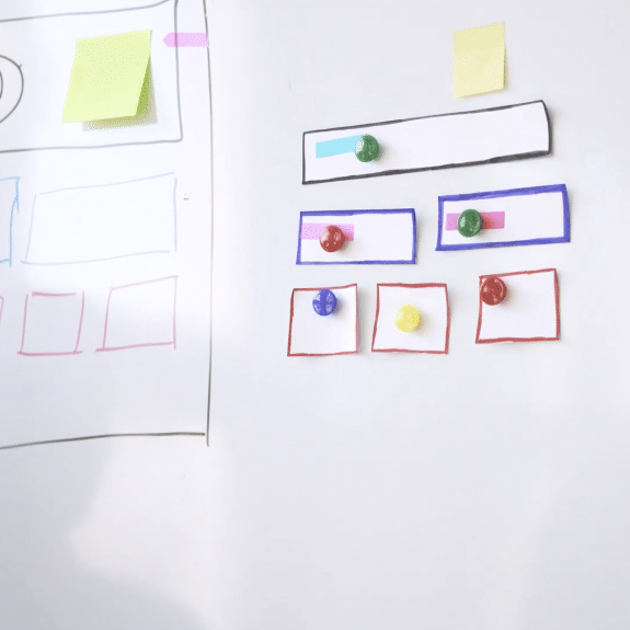
A timeline is a visual representation of a sequence of frames on a horizontal line. Every frame is a part of the motion so, the more frames you have in a timeline the smoother and slower your final motion will be. Fewer frames produce quicker and sharper motion. We can animate pretty much any visual property on the screen that would serve our purpose. Like an objects position, color, shape, opacity and size.
The magical world of animaton
Just like crafting a good experience, letting the user know what your UI is doing inside the structure of your product is an important part of digital design.
Shapes have personalities
See the moving shape above? what do you see when you look at it? Probably a ball bouncing on the ground, a ping-pong ball maybe? But it feels heavier, then maybe a basketball? What we actually see is a digitally created shape moving up and down with a certain amount of velocity. It‘s not a ball, but our mind deceives us into thinking as one. It relates to the objects that we see in the real world around us, constantly comparing and trying to make a meaning. Giving that familiar feeling of feedback is an essential part of what we do as designers, since we’re designing a digital world that we otherwise can’t feel and relate to.
Our brain works in mysterious ways
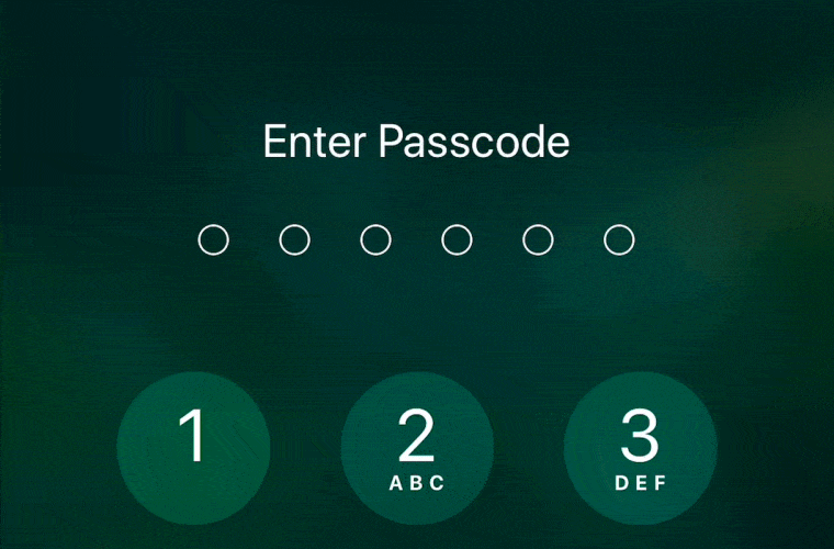
The visual feedback we get from the -ever so subtle- glowing blue hue of our screens affect our understanding and our interactions. If we enter our password wrong while we’re unlocking our phones, it’ll shake it’s head telling us we made a mistake, giving us fast and helpful feedback. We immediately understand this because we see this gesture in our everyday lives and we can relate to it.
When an object in the real world starts to move, it will not reach it’s top speed instantly. It will gradually build up speed and continue moving. Something as simple as adding ease to an object that stars to move actually mimics the real world. It makes the movement seem realistic and we as users relate to these interactions much easier.
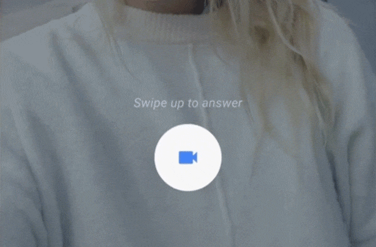
In the example below, during an incoming call, the button is struggling to move up, this visual feedback guides the user to swipe up. we would understand this even if there were no text.
Why we use animation
Animations aren’t necessarily meant to make things look cool, when used thoughtfully, animations can add contextual information where there is none. It can hint what is going to happen after an interaction, help guide the users focus, distract them from the events happening backstage and give visual feedback when an interaction is made.
Depending on how we interact, these actions can engage or confuse a user. To send our message in a clear way we should consider minimizing the gap between what the user expects, and what they experience. These interactions can be happening in, during or after an interaction has been made.
So we should use animation everywhere?
Although the idea sounds very tempting, motion should be mainly used to deliver a message, strengthen an idea or make the interface more usable. It’s a tool that captures the users attention and provides visual feedback that guides them in the flow. If used efficiently it can help users relate to our product and make it feel unique.
We should animate interfaces not because it looks nicer, but add meaning and make our products easier to use.
So, if some really cool tech came out yesterday and you’re craving to use it, you might want to hold on to that feeling, making sure you’re establishing a connection with the world by helping the user relate to the product, animating your scenes with a consistent UI model and defining the relationships between screens and elements.